


We have to make the z-index for the preamble div higher than z-index for pageHeader div because otherwise the text in preamble is hidden by the pair of flowers. But, just setting z-index isn't enough because z-index only works if the element is positioned. So we have to do some kind of positioning on preamble. By doing position: relative; with no top or left values given, we are doing positioning, but not really moving the div any. In other words, the relative position is only for making the z-index work.
#preamble, #explanation, #participation, #benefits, #requirements {
    position: relative;
    z-index: 105;
}
With the new z-index, preamble text is no longer being covered up. The text "The road to Enlightenment" is now visible.
#preamble, #explanation, #participation, #benefits, #requirements {
    margin-left: 250px;
    position: relative;
    z-index: 105;
}
One problem is that the unearthed text is overwriting the flower image and it also has to get out of the way to make room for the left side navigation bar. So I added a left margin rule to our style above. All five div's will be pushed away from the left edge of the frame by 250 pixels.

Do you see that tiny wisp right above us?
Looks like a minituare fly-fishing lure, you can easily miss it if you are not looking. We repeat "pattern_reverseNEW97x4.jpg" which is only 4 pixels high to build the right edge. So our updated selector will now include a background rule:
#preamble, #explanation, #participation, #benefits, #requirements {
    margin-left: 250px;
    position: relative;
    z-index: 105;

    /* fading edge on the right */
    background: url(images/pattern_reverseNEW97x4.jpg) 100% 0 repeat-y;
}
What starts out as a miniscule bit builds up with successive divs and helps give the page depth by lifting it off the white background. Our text is writing over the background images for #preamble, #explanation, #participation, #benefits, #requirements div's but that's easy to fix.
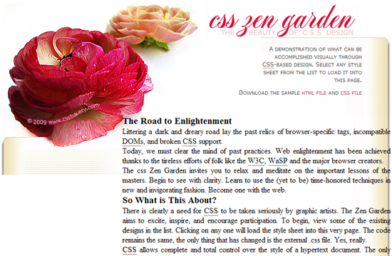
In the top left corner, the preamble div text is getting too close to the edge of the red flower so we nudge it down a little by 15 pixels and also pull the text that's spilling over the right edge by giving all five div's 40 pixels right padding. This is how the page cleans up with additional padding.
#preamble {
    padding-top: 15px;
}

#preamble, #explanation, #participation, #benefits, #requirements {
    padding-right: 40px;
}
To match the beige edge of the right side and also to continue the pattern underneath the flowers of pageheader div, we will make the same pattern the background of both intro and supportingText div's. It doesn't look like much on its own below but wait until we stack them up.

To understand why only two div's, intro div and supportingText div, are sufficient to build the entire left side edge, see the two "medium blue" blocks (why did I have to use different shades of blue instead of distinct colors?) in the mark-up diagram. The div's pageheader, quickSummary and preamble are a subset of intro div. The supportingText div contains explanation, participation, benefits, requirements and footer div's as you can clearly see in the element flow chart. You can of course simply check the mark-up itself which is what you'll do ordinarily.
#supportingText, #intro { background: url(images/rep413x4.jpg) 0 0 repeat-y; }
With the text nudged over to the right and the new background image repeating itself vertically, we now have a blank patterned canvas ready for the left side navigation bar.
The number of times the background image repeats is dependent on the height of the div's which is allocated dynamically based on the content and font-size. If the user changes his text size, your div's will get longer to accommodate the larger text and their background image will repeat more times to fill in the div space.
FONTS AND HEADINGS
#preamble p, #supportingText p {
  line-height: 1.66em;
  margin: 0 1.5em;
  padding: 0.5em 0;
  font: 0.8em Tahoma, Arial, Helvetica, sans-serif;
  color: #566047;
}
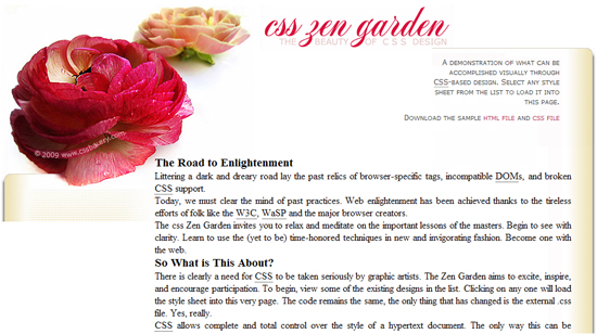
To change the default font, I wrote selectors for preamble and supportingText div's. The page with the font change. We'll finish up with text by styling the headings. I want a contrasting font to the clean sans-serif we used for the body so I chose a serif font "Times" for the headings, opened up the font a little bit with letter spacing, gave it a red color that matches one of the blooms and the main title.
#preamble h3, #supportingText h3 {
  /* headings like the road to enlightenment */
  font: 1.2em Times, "Times New Roman", serif;
  letter-spacing: 0.04em;
  color: #DD1947;
  font-weight: bold;
  margin: 1em 0 0.5em 0.5em;
  text-align: left;
  font-variant : small-caps;
}
The new capitalized red headings stand out without being distractive.
MARGIN COLLAPSING
But our layout has developed gaps. This is because of what's called the margin collapsing - the margins of the h3 element collapsed with the margin of its parent div. Since we have many sections or div's like that, the gap problem repeats itself through the body of the text.

To give you a simpler example, imagine having a div and a single h3 as the first element within this div. If the h3 has a top margin, it'll collapse with any top margin that the div may have and extend beyond the div. You may not even be aware of this phenomenon if the div does not have a background image. But if there's a backbround image that's being tiled, you'll see similar gaps. Always keep in mind that the browser renders a background image only over padding, never over a margin.

So in the first figure above, the top margin of h3 is adjacent to the top margin of its parent div, and is therefore collapsing through the top of its parent div. This is the correct behaviour as defined in the CSS Standard. Think of it this way: When you have a parent div and the first child of that div has a top margin, then the margins of the div and its first child get combined (or "collapsed") into a single margin for the two of them. In this case, the child h3's margin is larger than the div's margin so the h3's margin is used by the div. But this only happens when the div's top margin and the child's top margin are adjacent to each other.
As shown in Figure two, to address this problem, we assign a 1 pixel padding to the parent div, at which point, the browser says, "Ok. I have to first address the 1 pixel space for the top padding of the div and then, and only then, allocate the space for the h3 top margin. I won't be collapsing the margins together in this case because they aren't adjacent. They are separated by the 1 pixel of padding."
So with this fix, the h3's margin will automatically stay within the div because the div's padding has to stay within its borders, and the h3's margin will be rendered just below the div's top padding. So that's why the margin of the h3 will no longer be sticking out of the top of the parent div. You can also think of it as if the div has expanded to contain the h3's margin, along with the new top padding.
#explanation, #participation, #benefits, #requirements {
    padding-top: 1px; padding-bottom: 1px;
}
If we add padding to each of these div's, they will expand to contain their descendants, p and h3 elements in this case, and all of the margins associated with these elements. Since we are doing this as a workaround, I will make the paddings negligible at 1 pixels each for top and bottom which fixes the gap problem.
Finally, I want to open up space in the requirements div to fit some images that I'll be dropping into the design later.
#requirements {
  margin-bottom: 160px;
  padding-bottom: 5px;
}
The large bottom margin gives the page some breathing room in the bottom area. You might wonder why we cut off the beige edging on the right side short while the shading on the left edge is extended via the requirements div. Just wait until a later post when we will fit a graphic image into the blank corner to complete the frame. You'll see why we don't need to shade that part of right side edge.
No comments:
Post a Comment